Finding calligraphic inspiration in unexpected places

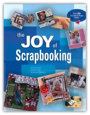
The Joy of ScrapbookingYes… I know… you came here looking for information on calligraphy, and were greeted by the front cover of The Joy of Scrapbooking.

But despite what you’re thinking, I haven’t gone over to the dark side. I’m still a calligrapher, not a scrapbooker. And if you bear with me you’ll find that there’s method in my madness (and maybe a little madness in my method, but you can be the judge!).

I’ll get back to The Joys of Scrapbooking in a moment, but I’ll lead you there with a question that is regularly asked of me by my calligraphy students. “Do you need to be artistic to be good at calligraphy?”

I never hesitate in answering, “no.”

Of course, it is advantageous for an incipient scribe to be creative, imaginative, and naturally good at art. Calligraphy projects will definitely benefit if executed by someone possessing those qualities. But such qualities are not essential in the quest to become a competent calligrapher (in my opinion, the requirements are guidance, application, discipline, lots of practice and patience).

Despite my profession, I confess that I don’t regard myself as naturally creative or artistic. And although I’ve been producing original calligraphic artwork for the past twenty five years, ideas have never come easy. The problem is I have little, if any, imagination.

designMany years ago, as a school pupil in art class, I had no difficulty drawing a still life. If a vase of flowers was placed in front of me, I could produce a passable sketch in no time. But if I was asked to draw something from my imagination, without any props, I was incapable. If I couldn’t see it, then I couldn’t create it. And, all these years later, little has changed. My calligraphic creativity requires kick-starting from visible sources.

For decades, when seeking such inspiration for my artwork, I scanned my many calligraphy books for ideas. I didn’t copy or plagiarise other calligraphers’ work. I was simply looking for appropriate design layouts and colour schemes that inspired me. As soon as that initial spark fired up my creativity, my own talent and expertise took over and saw the job through to completion.

Searching through those calligraphy books worked for a while, but I eventually became so familiar with their illustrations that they no longer did the trick. I began to look for inspiration in design books with a typographic slant, since remaining within a lettering context seemed to be a natural progression. I was immediately inspired by the content of many excellent books including, Roger C Parker’s Looking Good In Print, Robin Williams’ Design Workshop, and Leslie Cabarga’s Logo, Font and Lettering Bible. But I didn’t appreciate how much I was limiting my progress by seeking inspiration only within the confines of the lettering arts.

That changed unexpectedly a few years ago when I found myself in a Glasgow bookstore, browsing books in the arts and crafts section. Having exhausted the calligraphy and typography books, and with time to kill, I began to idly leaf through books on crafts that held no interest for me… or so I thought.

I’m not sure what I expected to find when I opened a copy of The Joy of Scrapbooking, but it certainly wasn’t the treasure trove of original designs and amazing colour schemes that confronted me. I was transfixed. Up to that point I knew nothing about scrapbooking (I still know very little), but the more pages I turned, the more enthusiastic and inspired I became. The book was crammed with amazing examples of scrapbooked artwork that incorporated well-executed typography and occasional examples of hand-lettering. And I was knocked out by the original design layouts, varied colour combinations and wonderful textures. A bonus was the inclusion of tips on digital scrapbooking that I could easily apply to my digital calligraphy projects.

Before I knew it, I was at the checkout with my credit card in one hand, and The Joy of Scrapbooking – my new favourite reference book – in the other.

This unexpected discovery taught me to expand my horizons in terms of where I sought inspiration for my calligraphy, and I began to unearth further resources within non-calligraphic books. A fine example is Peter King & Company’s,1000 Greetings, which features inspirational designs in the form of “creative correspondence for all occasions.” I discovered the book by accident in my local library, which was a lucky break, since its illustrations have sparked my creativity on numerous occasions.

In my experience, it is natural and easy for calligraphers to play safe, and stay within the boundaries of the lettering arts when seeking calligraphic inspiration. Yet other crafts and disciplines have much to offer… it’s just a matter of making the effort to peer over the boundary fence once in a while to check what’s on the other side.

So, the next time you are in a bookstore, stride past the familiar calligraphy section and browse some random craft books instead… you never know what you might find. And, if all else fails, you can always buy a used copy of The Joy of Scrapbooking from Amazon for £1.89 plus p&p (at time of writing). It definitely worked for me.

If you are a calligrapher, and have been influenced, motivated, or inspired by non-calligraphic sources, I’d be delighted if you left a comment sharing your discoveries.
How to avoid creating “visual chloroform” in calligraphy

Alan-Furber-1

When teaching calligraphy, I always take some of my calligraphy books along to let my students see what’s available. Although most of my books are quite old, and some are out of print, second-hand copies do crop up from time to time on Amazon Marketplace or on eBay, so the students appreciate being given the opportunity to ‘try before they buy.’

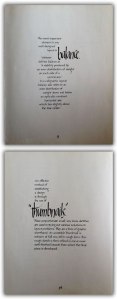
Sample pages from Layout and Design for Calligraphers

Sample pages from Layout and Design for Calligraphers

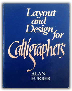
Last week I was browsing through my books at home, deciding which to choose for the class, when I rediscovered my absolute favourite calligraphy book of all time, Alan Furber’s Layout and Design for Calligraphers (see cover above).

As regular readers of this blog will know, I taught myself calligraphy from books back in the eighties. Books by Tom Gourdie and Margaret Shepherd were influential in teaching me how to create letters, but Alan Furber’s book made me realise that there was more to calligraphy than simple letter-making… it showed me how it was possible to make lettering interesting and exciting, avoiding “visual chloroform.”

Of all the calligraphy books I own, Layout and Design for Calligraphers taught me the most about applied calligraphy. As Alan Furber describes in the book’s preface, “The emphasis in this book is on layout, not letters.” I found it indispensable in teaching me how simple (not necessarily easy) the process is of arranging letters into visually harmonious relationships. Suddenly, I became aware of balance, contrast, dominance, and the importance of white space… design elements that had never occurred to me during my initial study of calligraphy.

For years, the book sat right next to my drawing board, convenient and easy to access. I referred to it on a daily basis, keen to integrate its instructions into every piece of calligraphy that I created. And it worked.

Based on how beneficial the book has been to my progress as a calligrapher, I believe that everyone who has an interest in calligraphy, whether beginner or more experienced, would benefit from owning a copy of Furber’s book. It is a slim volume, at only 64 pages, but every single (completely hand-lettered) page is designed to be a perfect example of how balance and white space are essential to the creation of eye-catching calligraphic compositions. And, although the book is aimed primarily at students of calligraphy, its graphic approach would prove equally useful to students of more general design.

While writing this post, I checked Amazon Marketplace in UK and found three copies of the book available for just 1p (plus £2.80 p&p). This is the bargain of a lifetime, and three people are going to get very lucky indeed if they move quickly enough.

Alan Furber's second book

Alan Furber’s second book

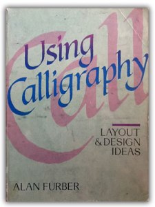
I also own Furber’s only other book, Using Calligraphy: Layout and Design Ideas. Although that volume is full of excellent ideas on how to improve calligraphic design, and is definitely worth seeking out, it doesn’t hold as special a place in my heart as its predecessor.

I hope I have turned a few incipient scribes onto Alan Furber’s two wonderful books. In my opinion, he is an unsung hero of calligraphy, and I cannot recommend his books highly enough.

One final tip… anyone who regularly purchases books from the main online suppliers, such as Amazon or The Book Depository, assuming them to be the cheapest, should instead try Book Butler (bookbutler.co.uk in UK, but there are international variations). For any given book, Book Butler shows the availability from every possible supplier in a list with the least expensive at the top. This is definitely my search engine of choice when seeking out books online. Hopefully others will find it useful too.


My caffeine-fuelled morning of procrastination

Deuchars coverMy intention this morning was to surf the web briefly. A quick peek at the net, I promised myself, just until I finish my first coffee of the day. But it didn’t work out like that.

Unexpectedly, I found myself distracted by a succession of very interesting creativity-related links, which necessitated a number of refills from the percolator. Not that I’m complaining!

Since I found the links to be both interesting and useful, I thought I’d share them. They’re not strictly calligraphic in nature, but they are connected to the craft, in that they include a free graphic design book, a short video on creativity, and a podcast interview with a hand-lettering artist.

So here is a quick summation of the virtual gems I discovered this morning, (while drinking coffee and neglecting the work that should have claimed my attention).

Marion Deuchar's hand-lettered Annual Report design

Marion Deuchar’s hand-lettered Annual Report design

I started at Brain Pickings Weekly, a blog to which I subscribe. If you are a writer, a reader, or simply interested in creativity, you’ll love Brain Pickings, which describe itself as, “a human-powered discovery engine for interestingness, a subjective lens on what matters in the world and why, bringing you things you didn’t know you were interested in — until you are.” Through Brain Pickings, I have discovered many useful articles, books and links, including those described below.

From there, a link led me to an excellent FREE graphic design book, The Vignelli Canon, which you can download here in PDF format. A hard copy of the book presently costs £12.80 on Amazon. The book has earned 5 star reviews, so it’s worth grabbing a PDF copy while it’s available. Did I mention it’s FREE?

My next link led me to an excerpt from a lecture on creativity by Monty Python star, John Cleese, called “Five Factors To Make Your Life More Creative.” This thirteen minute Youtube video is both humorous and insightful, and more than a few of Cleese’s observations about procrastination struck a chord with me. In fact, this morning, this entire post of mine is borne of procrastination. I really need to knuckle down!
If you have more time, you can watch the entire thirty-six minute lecture here.

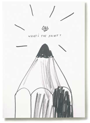
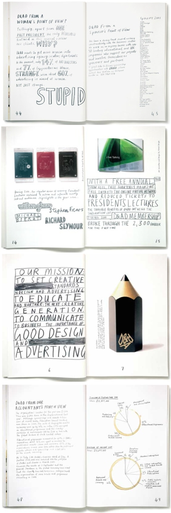
My final link led me to a Graphic Design podcast called Design Matters on iTunes. Find it here. I listened to the most recent broadcast, which features an interview with Marion Deuchars, a designer, illustrator, and lettering artist. Among the topics discussed are her views on the expressiveness of hand-lettering. Interestingly, in 2002 Deuchars designed an Annual Report for D&AD, in which she used no photography or typography. She wrote all 5946 words of text in pencil, and sketched all of the illustrations by hand. Due to such an original approach to the document’s design, it is one of the few Annual Reports that people actually want to read. You can see why in the page that I’ve featured at the top of this post, and those on the left. More of Deuchar’s illustrations and hand-lettering can be found at Marion Deuchars.com.

Uh oh, I’ve just realised that it’s now approaching midday. What began as a few minutes’ surfing at 9am has ended up stealing my entire morning. I’d better start my work now.

But first I’ll fire up the coffee machine… pour myself another strong cup of Java… maybe do a little more surfing while I drink it…