Ink – Written by Hand (a short film about handwriting)

I’m grateful to my son, David, a designer, who regularly sends me links to interesting calligraphy-related items. Despite being a non-calligrapher, David has a knack of discovering calligraphic gems that I somehow remain oblivious to.

He recently pointed me in the direction of ‘Ink – Written by Hand,’ a short film about handwriting by filmmaker/cinematographer, Ryan Couldrey (watch the video above).
Screenshot 2015-10-07 11.19.17Ryan filmed Tanja Tiziana, a freelance photographer from Toronto, Canada, on her short journey to rediscover the written word. The resultant film is a beautifully-shot, nostalgic glimpse into the lost art of handwriting, which will appeal to anyone who has an interest in lettering.

During the film, Tanja states that since most children now own a smart phone or tablet, they are more likely to text a message than to pick up a pen and write it longhand.

“It’s wild to think that, as an art-form, (handwriting is) completely lost to a generation,” she concludes.

Personally, I have difficulty comprehending the possibility that future generations will not discover the joy of putting pen to paper. In a previous post, the demise of handwriting in schools, I attempted to remain optimistic about the future of children’s handwriting. But reluctantly, and resignedly, I have to accept that Tanja’s view is more realistic than mine… that one day handwriting will become extinct.

Hopefully, that day is a long way off!

***

Immediately after writing this post, I discovered a comment on a blog about handwriting. The comment reads as follows…

“It genuinely saddens me and a host of others that cursive/italics is no longer taught in a majority of schools. My mom, who has terrific penmanship, wrote a birthday card to my 16 year old daughter. Daughter texted me a photo of the card and asked me to translate it for her.”

Oh dear! Lets all hope that, in terms of the next generation, the daughter is the exception rather than the rule.

***

If you liked the video above, you will also enjoy ‘Ink Spills’ (extended interview clips) here.

Find out more about Ryan Couldrey, and watch some of his other short films, on his website.

And finally, for anyone who is interested, the nib that Tanja used to write the final credits is a Nikko G.
Snow is such an amazement

SnowWell, the forecasters promised snow, and they didn’t disappoint. A four inch blanket of the white stuff settled on my garden overnight.

So this morning, before it was even light, I was all wrapped-up in my winter woollies and outside in the freezing cold, clearing my path and driveway with my brand new, just-out-of-the-wrapper, snow shovel. The neighbours surely thought I was mad, shovelling away in the pitch-blackness. But I had paid good money for the shovel, and I was determined to put it through its paces before the snow thawed of its own accord.

Completely hidden under a thick layer of snow, my wife’s car resembled an igloo on wheels. Since she would soon be leaving for work, I morphed into dutiful husband mode and unburied it for her. After ten minutes of effort, breathless and bent double with exertion, I watched her slide effortlessly into the driver’s seat, and turn the ignition.

The original photo.

The original photo.

“Thanks for scraping my car,” she said, matter of fact, as if I had removed a slight dusting of frost from her windscreen. The words ‘hero,’ and ‘unsung,’ sprang to mind. As she reversed out of the drive, she waved goodbye. Still breathless I tried, but failed, to summon the energy to wave back.

By the time the sun eventually rose, my home was a snow-free zone and I rewarded myself by walking to a nearby country park, where I hoped to snap some winter scenes on my iPhone. I arrived at the park early enough to discover that many of the snow-covered paths around the loch remained free of footsteps. I was delighted, as I think there is something really satisfying about being the first to tread a path through virgin snow.

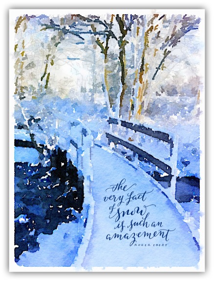
As I walked, I noticed a little snow-covered bridge up ahead, under a canopy of trees, and realised immediately that it was the perfect image to which I could add a calligraphic quotation (I’m a sad person… I know). From experience, I know that taking photographs as backgrounds for my calligraphy is different from normal photography, in that it’s essential to incorporate a blank space in the composition to contain the calligraphy that will be added later. I knew instantly that a small area of untrodden snow in front of the bridge would work perfectly.

I used an amazing app called Waterlogue, that is installed on both my iPhone and iPad, to create a watercolour painting from my bridge photo. I have tried many similar apps to get a watercolour effect on my photos, but Waterlogue is by far the best. The results are spectacular, and I can highly recommend the app if, like me, you love watercolours but can’t paint to save yourself.

With the "Waterlogue" effect applied.

With the “Waterlogue” effect applied.

I then did a quick Google search for an appropriate quotation about snow. I loved the following quotation, by Carol Rifka Brunt:

“… there’s just something beautiful about walking on snow that nobody else has walked on. It makes you believe you’re special, even though you know you’re not,” 

The sentiments are perfect but, unfortunately, it was too long to comfortably fit into the allocated space.

Instead, I chose, “The very fact of snow is such an amazement,” by Roger Ebert. Short and sweet!

After lettering the quotation in black ink, I scanned it into Adobe Photoshop and inserted it onto a layer on top of my ‘watercolour’ image. I then experimented with the size of the lettering, and tinkered with its position until I was happy with the composition. Finally, I sampled a darkish blue from the background and used it to colour the calligraphy. The finished artwork is featured at the top of this post.

All in all, it has been a perfect morning. Walking in beautiful scenery, photography, calligraphy, Photoshopping, blogging, and road-testing my brand new snow shovel.

This might just be as good as life gets!

Fairies, flowers, and procrastination.

Garden quoteThis morning, although I should have been working, I took time off to create something calligraphic and colourful for my own enjoyment. I thought it would be nice to celebrate the arrival of Spring with some flowers, so I did just that, and I’ve featured the resultant artwork above (or see it on Flickr).

I decided to use a particularly floral scene that I remembered snapping with my iPhone last July (yes, I agree that makes the theme more Summer than Spring, but we calligraphers own an artistic licence that allows us to take liberties such as switching seasons around on a whim).

The photo features a cottage and garden that reside in the grounds of Culzean Castle, which enjoys a dramatic clifftop setting on the rugged Ayrshire coast of Scotland. Standing on the battlements, you are rewarded with stunning views across the Firth of Clyde to the islands of Arran and Ailsa Craig, and to the Mull of Kintyre. If you ever find yourself in the west of Scotland, Culzean Castle is definitely worth a visit.

On the day of our visit, the flowers were in full bloom… I remember being in awe of the incredible carpet of colour leading up to the cottage… and when I returned home and downloaded the photo from my iPhone to my Mac, I was amazed that the phone’s camera had captured the scene so well.

The original photo.

The original photo.

Although I had snapped the scene on a cloudless, sunny day, the sky in the photo had turned white through being over exposed (see original photo on left). So the first thing I did was replace the sky using Adobe Photoshop. This was a simple process by which I removed the white sky using the Magic Eraser Tool, then placed a photo of a more interesting sky in a new layer behind the original photograph.

Using PhotoTools, a free Photoshop plug-in, I added a subtle Impressionist filter to the entire photo to soften the flowers and to give the photo a slight painterly feel. I then used PhotoFrame, another free plug-in, to add a distressed border. (Both free plug-ins are available for Mac only).

All I had to do then was add the focal point, in the form of some appropriate hand-lettering, so I googled “flower quotes,” to enable me to find something relevant to write. Usually I spend ages looking for the perfect quote, but this time I was happy with one of the first I found, by Douglas Adams. The quote’s reference to fairies gave it a whimsical feel that I felt suited the style and subject of the photograph.

After writing the quote in black ink, I scanned the lettering into Photoshop and inserted it, line by line, into new layers above the garden photo. Then I resized, recoloured, and positioned it until I was happy with the layout. I tried colouring the lettering every hue under the sun, but only white stood out enough to make the words legible against the backdrop of multi-coloured flowers. I added a very subtle drop shadow behind the white calligraphy to help it stand out even more.

And that has been my morning’s “work.” I do feel guilty, since I ignored a pile of invitations next to my drawing board, all waiting to be inscribed, in order to create this post. But sometimes it’s nice to create something for the fun of it, rather than with a view to writing an invoice.

And now it’s midday, and time for lunch. Then, perhaps, I’ll attend to the invitations.

Procrastination.

After calligraphy, it’s my favourite pastime.

Autumn is the hardest season

Autumn is the hardest seasonEvery Autumn, I make a point of going out and about with my camera, getting snap-happy with the golden, terracotta and burnt umber foliage that graces my local park. The resultant photographs provide a background for a hand-lettered seasonal quote that becomes my traditional Autumn post.

This year, for some unknown reason, Autumn snuck up on me. Disappointingly, by the time I visited the park most of the trees had already shed their leaves, so it was back to the drawing board and Plan B.

After much consideration, I decided to create a simple greetings card design.

I layered a diamond shape in Photoshop with an assortment of autumn-coloured leaves (the shape started out square, but I quickly discovered that revolving it by 45 degrees made it more interesting). I wrote out the quotation using black ink and coloured it using Photoshop’s colour-picker tool, which allowed me to sample various colours from the leaves image. The common colour scheme tied the lettering and the image together. Conveniently, the completed composition fitted perfectly into a square, which I surrounded with a narrow border, the colour of which I also sampled from the leaves image.

The resultant artwork, shown above, was not as satisfying to create as the artwork in my previous Autumn posts (here, here and here), but a departure from tree-themed artwork was probably long overdue anyway. All I need now is a square envelope, and a postage stamp, and a friend who would appreciate receiving an Autumn-themed greetings card.

In the meantime, so that I don’t miss out again next year, I’ll set my phone to notify me of the start of Autumn 2014.

It’ll be here before I know it.

Autumn… a second spring

Autumn again, and time for me to celebrate the season’s spectacular beauty with a wee bit of photography and calligraphy. I can’t believe that a year has passed since I last did this. It’s actually my third autumn post (view my first and second), so it’s already beginning to feel like a tradition. To be honest, the only reason I feature autumn in a post every year is because it’s my favourite season, and my blog gives me an excuse to wallow awhile in its magic. I do appreciate the other seasons’ merits, but the sights and smells of autumn, to me, are the most evocative.

A few days ago I pulled on my walking boots and began my search for an autumnal scene with potential… one that I could photograph and feature in my still-to-be-written autumn post… but I couldn’t find what I was looking for. I wanted atmosphere and colour and composition, but the scene also had to include an inviting empty space into which I could slip an autumn-related quote. The difficulty lay in trying to envisage such a final image, complete with quote, while walking in circles around various trees and mounds of fallen leaves, assessing their potential… a pastime that drew curious glances from a steady stream of dog-walkers.

On top is the original unprocessed photograph, complete with bench and lamp-post. Below shows the photograph after being horizontally flipped, and shows the cropped area that I used (note the absent bench and lamp-post). Click image to increase size.

Fortunately, when I eventually did discover a scene that I thought might work, I was carrying my mobile phone (a Sony Ericsson Xperia which has an absolutely amazing camera) so I was able to capture the scene without attracting too much attention. I intentionally snapped a bigger area than I would need (see top image on left), so that I could experiment with the composition. The resolution on my phone’s camera is so good that I was able crop the image at a later stage without losing too much definition.

As you can see, the original unprocessed photo definitely wouldn’t win any photography awards, but I saw potential in the golden-leaved tree and its carpet of fallen leaves, and I was able to manipulate the image quite easily on my iMac to suit my requirements.

First, I tweaked the basic image’s Levels and Curves in Photoshop, then I cloned out the bench and the lamp post behind the tree. Using PhotoTools, a Photoshop plug-in, I gave the image an instant HDR effect. I then placed two different textured layers above the image and set one to ‘overlay,’ and one to ‘hard light.’ Utilising the Rule of Thirds, I cropped the image’s dimensions to zoom in on the tree, then added the distressed border. Finally, I flipped the image horizontally, simply because I felt the quote would look best on the left side of the tree.

All that was left to do was find the perfect quote to write and insert into the image, but that task proved as difficult as finding the perfect photo. After reading dozens and dozens of autumn-related quotes, I eventually drew up a short list of four worthy contenders. I chose, “Autumn is a second spring when every leaf is a flower,” because I thought those sentiments best complimented the image.The other contenders, which I’ll hold onto till next autumn, were…

 “Autumn is the hardest season. The leaves are all falling, and they’re falling like they’re falling in love with the ground.” (Andrea Gibson)

 “Autumn… the year’s last, loveliest smile.” (William Cullen Bryant)

 “Love the trees until their leaves fall off, then encourage them to try again next year.” (Chad Sugg)

With those three quotations already in the bag, all I have to do next October is search for another appropriate scene to photograph. But even if the perfect scene proves as elusive as this year’s, I can think of few better ways to spend autumn afternoons than wandering through my local park, camera in hand. Particularly when ‘every leaf is a flower.’

Amazing the difference a few days makes!

POSTSCRIPT

Today, I became aware of the fleetingness of Autumn’s beauty when I walked past the tree featured in the above post. Unbelievably, during the few days since I photographed the tree with its abundance of golden leaves, it has become stripped of its splendour, and its branches are now almost bare as shown on the left. Since it was more by luck than by design that I stumbled upon the tree in all its glory, I feel fortunate to have been in the right place at the right time. Hopefully, I’ll be just as fortunate in my hunt for the perfect autumn scene next year!

Harmony in Autumn

I can’t believe that a year has passed since my last Autumn post… where does the time go? So with only a few weeks left in November, I thought I’d better get cracking with a new piece of autumnal calligraphy, before winter sets in and I miss the boat!

Even though my main passion in life is for calligraphy, I love photography, and I get kind of snap-happy in Autumn. There is so much colour to capture at this time of the year. And I love to marry my two interests by using my photographs as backgrounds for my hand-lettering. I enjoy searching for that certain scene that will eventually lend itself to an appropriate quotation. I can’t think of a more satisfying way to create original artwork.

A professional photographer once shared a tip with me. He told me, “when you’re out walking, looking for subjects to photograph, every once in a while stop and look behind you. If you don’t, you never know what amazing shot you might miss.”

So, on a recent walk through Glasgow’s Kelvingrove Park, I followed his advice. I stopped on the path, turned around, and couldn’t believe my eyes. There was Glasgow University Tower rising high above me, perfectly framed between the bare branches of surrounding trees. It couldn’t have been better positioned if I had asked it to pose for me. There were golden leaves everywhere, and the darkening sky just added to the mood. So I raised my camera, took the shot, and hoped for the best.

I later imported the snap into Photomatix, (HDR software) where I tweaked the controls to emphasise the autumn golds, and to make the sky heavier and more moody.

I then imported the snap into Photoshop, where I placed textured layers above it and altered their blending modes to “hue” and “soft light” to create a monotone effect, with emphasis on complementary shades of gold and brown.

The bottom third of the photograph was almost entirely free of foliage, making it the perfect place to position my hand-lettered autumn-related quotation. I used the colour-picker to sample the colour of some leaves on the right, and transferred the colour to the focal point, “harmony in autumn.” I coloured the remaining text in a more neutral shade, just to provide some much-needed relief to the vivid autumn colours that dominate the photograph.

See the finished piece at the head of this post.

I used a similar technique to manipulate the photograph featured above, that I took of Glasgow University while standing on a bridge over the River Kelvin. The only difference being that I applied a horizontal gradient effect to “watch the leaves turn,” in an effort to simulate the changing colour of leaves in autumn.

These images were a lot of fun to create, both calligraphically and photographically (and, of course, photoshopically), and I’m really pleased with how they turned out.

So, coming soon is my traditional “Winter” post. I must remember to stop and look behind me in the hope of discovering further serendipitous photo-opportunities… weather permitting!

A magical event

Last September I posted a piece of calligraphy that I created to celebrate Autumn. At the time I wrote, “now that I’ve covered Autumn, I feel committed to creating a further three pieces of artwork to complete the seasonal set. Watch out for Winter, Spring and Summer appearing sometime within the next 12 months.”

Famous last words!

The original photograph, before being cropped and texturised. Note the metal fence on the left side, that I removed using the clone tool in Photoshop.

I did take photographs during the heavy snowfall in November, with a view to using them as a background for my calligraphy, but somehow never got around to creating the “Winter” piece that I promised. Now that the crocus and daffodils are making their presence known, I have made a rather belated effort to get back on track. Especially since I have to start thinking about a “Spring” piece soon.

I took the original photograph of a row of trees in a local park, just after a particularly heavy snowfall, and imported it into Adobe Photoshop. I wrote out the quotation in Italics (using black ink), then scanned it, and incorporated it into the artwork. I coloured the lettering white and applied a subtle drop-shadow to it. I overlaid the photograph with a number of different textures that I tinkered with in layer blending mode. A few of the textures that I used are available from Kim Klassen Cafe, an excellent website to visit if, like me, you enjoy texturising your photographs.

Now I’m hoping that some inspiration for my “Spring” piece will come my way. Hopefully it won’t take till August to arrive.

EDIT, 9th March… woke up to find an unexpected dusting of snow outside this morning, so maybe I’m not so late with this post after all!

HDR photography with calligraphy (2)

Having featured Edinburgh in an earlier post, I thought I’d show my impartiality by creating another piece featuring Glasgow.

From my vantage point on Bell’s Bridge, I photographed the Finnieston Crane and the “Squinty Bridge,” and created an HDR image from the photograph using Photomatix. I hand-lettered the chorus of The Song of the Clyde, scanned it, and incorporated it into the photograph using Photoshop. Then I coloured the lettering white and gave it a subtle drop shadow to integrate it with the grey clouds.

Before I settled on using the chorus of Song of the Clyde for this piece, I googled “Finnieston Crane” in the hope of finding some appropriate words for the image. When I unexpectedly stumbled upon the following story, my jaw almost hit the floor.

**********

DISMANTLING WORK BEGINS ON FINNIESTON CRANE

Work began in the early hours of the morning to dismantle Glasgow’s iconic Finnieston crane in order to use its steel for a massive art project in Edinburgh city centre, STV News can reveal.
For three-quarters of a century, the crane at Finnieston on the banks of the Clyde has symbolised Glasgow’s pride in its heavy engineering heritage. Built in 1931, and properly known as Clyde Navigation Trustees Crane Number 7, it was used to lift heavy goods such as tanks and railway engines on to ships.
But now the A-listed structure is being dismantled and, to the horror of Glaswegians, the steel will be used to construct a modernist version of the Eiffel Tower in Princes Street Gardens in Edinburgh.

**********

The original unprocessed photograph

It gradually dawned on me that the story was in fact an April Fools joke played on an unsuspecting public by STV news. Bad enough that I fell for an April Fools joke, but falling for an April Fools joke in October must make me a special kind of fool.

But at least the Finnieston Crane is staying in Glasgow.

Calligraphy takes flight

Having an interest in graphic design, I subscribe to “Living Design,”  a tremendous resource for creative and curious minds.

While reading their latest post this morning, I was drawn to the leading photograph, a beautifully vibrant calligraphic letter “O” reproduced above. I immediately assumed that the blog’s author, Asif R Naqvi, had produced a feature on calligraphy.

Not so.

Despite the “O” being created with Sumi calligraphy ink, the calligraphic shape didn’t evolve from a pen or brush, but from high-speed strobe equipment that photographs liquid in mid-flight. Remarkably, the beautiful “O” is ink that was photographed while suspended in mid-air, and its creator is not a calligrapher but a photographer called Shinichi Maruyama who has developed a fascination for liquid and motion imagery.

The full “Living Design” article featuring Maruyama’s art is here. In particular, look out for the brief, but stunning, slow-motion video that shows Maruyama creating his fantastic water sculptures.

As someone who writes with a medium nib much of the time, all I can say is “WOW” to the sheer scale of the calligraphic shape being created by Maruyama above. The photograph is reminiscent of the scale and vibrancy of the lettering by calligrapher Denis Brown.

See more examples of Shinichi Maruyama’s incredible water sculptures here.

Fall is the Artist

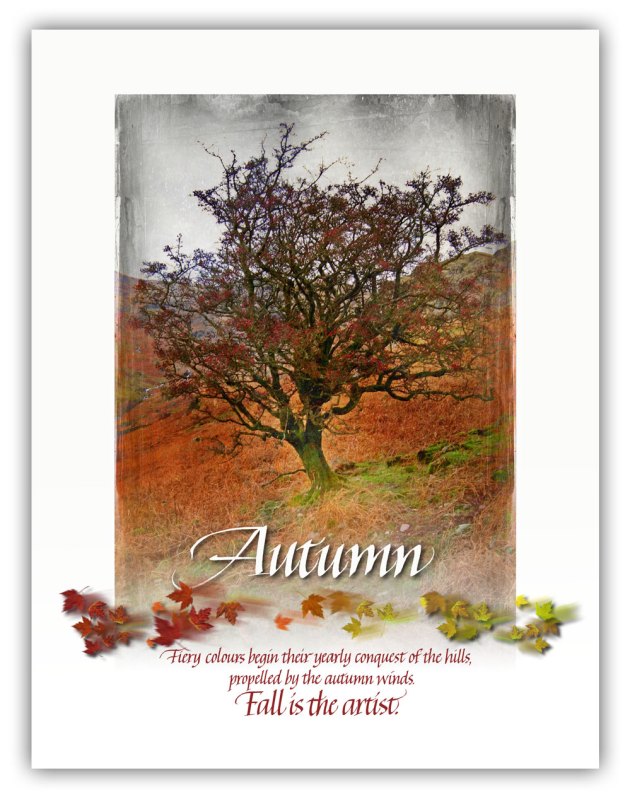
With leaves now beginning to fall from the trees, and a sudden chill in the air, I was inspired to create a piece of calligraphy to celebrate Autumn.

My original photo. Despite its apparent mediocrity, I knew it would come in handy!

I dug out this photograph of a (Rowan?) tree that I captured while in the Lake District a few Decembers ago, as I felt it was the perfect image to feature in the artwork. In Photoshop, I experimented with layer styles to achieve a “weathered” look that I thought conjured an Autumnal feel.

A quick Google search produced the perfect short quotation, which I wrote out in Italics (using black ink), scanned, and incorporated into the artwork. I coloured the word “Autumn” white, and applied a subtle drop-shadow to it. I then used the colour-picker in Photoshop to sample the tree’s red berries, and applied that colour to the quotation to tie the words and image together. A transparent gradient at the bottom of the image allows the calligraphy to stand out. A scattering of autumn-shaded leaves in the foreground completes the image.

Only thing is, now that I’ve covered Autumn, I feel committed to creating a further three pieces of artwork to complete the seasonal set. Watch out for Winter, Spring and Summer appearing sometime within the next 12 months.